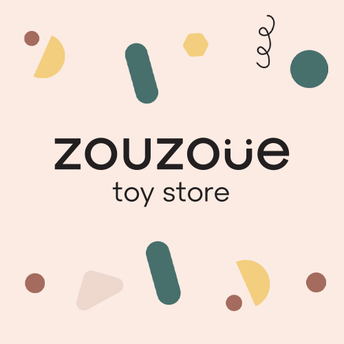
For the construction of the online store zouzoue, we tried with natural colours, simplicity, and minimal lines to create an image that exudes quality and care. With the addition of earthy elements to enhance emotional appeal and to have storytelling with character and consistency:
Visual Identity Design
Selection of a colour palette with earthy tones, ideal for high-aesthetic children’s productsα
Design of repeating patterns with abstract shapes for backgrounds, giving a playful & chic style
Use of modern and easily readable typography in headlines and body text
Homepage Design
Hero banner with a children’s element and product placement in a lifestyle scene
Custom icons for main categories (Toys, School, Children’s Room, etc.)
Visual blocks with CTA (e.g., “more”) for recommended products
Visual hierarchy that naturally leads visitors from the brand to categories and products
UI/UX Design
Mobile-first approach
Minimal but playful aesthetic supporting easy navigation for parents
Categorization with custom graphics and icons
Design of the “Favorite Toys” section with product cards on a white background for clarity
Branding Banners / Promotions
Integration of branded section for Globber (e.g., “It’s Globber Time”) with unique composition and typography
Design of promotional banner with wooden toy, circular text box & combination of photo with graphics
Responsive Footer Design
Organized information (useful links, contact, social icons) in harmony with the rest of the branding
Custom Graphics & Illustrations
Use of playful illustrations around the content (e.g., lines, doodles, shapes)
Design of icons and visuals that tie in with the eco-friendly/aesthetic of the brand
Visit the project zouzoue.gr